Know Your Icons Part 1 – A Brief History of Computer Icons: "
As with great works of art, you must look into the past to appreciate the future. With roots as far back as the 1970′s, the humble icon has come a long way. Following is a collection of icons though history. Although there have been many other operating systems in the time between 1981 – 2010, I’ve hand picked the ones of the most significance to modern icon design. These designs show just a small fraction of the icons in the many and varied User Interfaces throughout the years. To learn more about the history of User Interface Design you can find a comprehensive article on the subject on Wikipedia.
1981 Xerox 8010 Star — The First Consumer GUI Computer
In 1973 the Xerox Alto was the world’s first GUI (Graphical User Interface) based computing system. Designed around an "office" metaphor (also a first), the Alto was built as a research computer and therefore wasn’t available for commercial release. With 2,000 machines worldwide, the Xerox Alto was so significant, it was a source of inspiration for the Apple Lisa (1983). In 1981 the Xerox Star was released, incorporating many of the design features of the Alto. The Xerox icons demonstrate a consideration for human interaction. As you can see, Calculator, Document, Folder and Trash haven’t changed in almost 30 years.
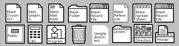
1981 – Xerox 8010 Star
1983 Apple Lisa — Popularized the GUI
Development of the Apple Lisa started in 1978 and was heavily influenced by the earlier Xerox computers. Hoping to carve a niche in the personal computing market, Apple adopted the office metaphor to make navigation easier for new users. Lisa was an advanced GUI for the time as it had movable "Desk Accessories" (early Widgets), drop-down menus and folder based directories. You can see the icons are not much different from the Xerox, except for the size and single pixel outlines, and the use of the computer as the preferences icon (it’s now common to use cogs).
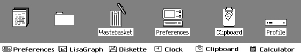
1983 – Lisa Office System 1
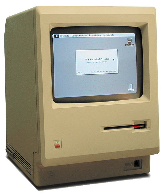
1984 Apple Macintosh 1.0 — Artist Designed Icons
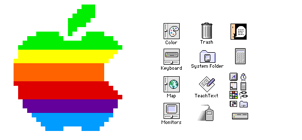
A year after Lisa the Apple Macintosh 1.0 was released. We now see drag and drop file copying, movable windows and fancy new icons! The Macintosh icons were designed by the now legendary Susan Kare. Susan Kare has to be the all time master of Icon design and was responsible for many icons including the MacPaint interface (fig 2). Kare’s philosophy on icon design is simple, "I believe that good icons are more akin to road signs rather than illustrations, and ideally should present an idea in a clear, concise, and memorable way. I try to optimize for clarity and simplicity even as palette and resolution options have increased." This philosophy is at the core of Apple’s early commercial success.
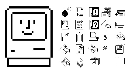
1984 – Macintosh System 1.0 (fig 1)
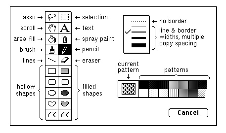
1984 – Macintosh System 1.0 (fig 2)
1985 Atari TOS — Isometric Icons
It’s important to note — for those a bit younger than us old sentimental computer users — that the GUI was not only for the Apple systems. The Atari ST had an OS called TOS which had a minimal interface also using the desk metaphor, which by then had become a computer standard. It’s interesting to see that the TOS has Isometric Disk icons (file drawers).
1985 – Atari TOS Version 1.0
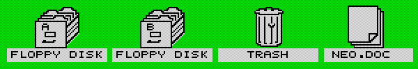
1985 Amiga Workbench — Four Color Icons
The Amiga Workbench was made for the Amiga 1000 personal computer. Despite the crudely designed icons, Workbench was actually ahead of its time. Including features such as customizable mouse cursors, four color graphics and multi-state icons. You can see the two states of the "Workbench" icon in the example below. The Amiga broke with the desktop convention and chose to use a workbench with drawers instead of files.
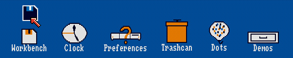
1985 – Amiga Workbench 1.0
1985 Windows 1.0x — Microsoft’s First GUI OS
In 1985 Microsoft finally released its first GUI. The icons are just as crude as the Amiga but don’t include color. It’s interesting to see that the first icons for Windows Paint employ different symbols to MacPaint, in particular the Spray Painter.
1985 – Windows 1.0x
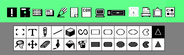
1986 GEOS for Commodore 64 — The Alternative OS
I’ve included GEOS for the Commodore 64 as, at the time, it was the second most popular GUI behind Macintosh 1.0 (based on units shipped). The icons have more character than Windows OS and share the Mac philosophy of clearly expressed metaphors.
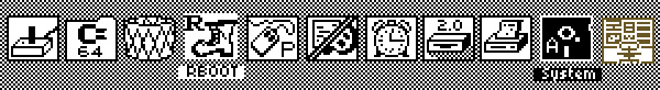
1986 – Commodore C64 GEOS
1991 Macintosh System 7 — First Mac OS with Colors
With System 7 we saw the introduction of color to the icons. You may notice that the icons are now slightly raised to appear "clickable".
1991 – Macintosh System 7
1992 Windows 3.1 — New Designer Icons!
In Windows 3.0 (1990) Microsoft employed Susan Kare (who first made icons for the Macintosh 1.0) who greatly improved the designs. In 3.1 Kare further refines the colors and designs for the icons. Windows 3.1 was the first Windows platform with pre-installed True Type Fonts.
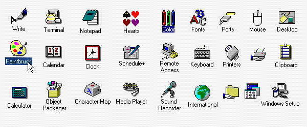
1990 – Windows 3
1995 Windows 95 — The Start Button
Windows 95 introduces more colors to the icons and a few more isometric designs. The Windows 95 design is a complete re-build and includes elements that are still part of Windows designs to this day. The elements include, the taskbar, the menu and Microsoft’s famous Start Button.
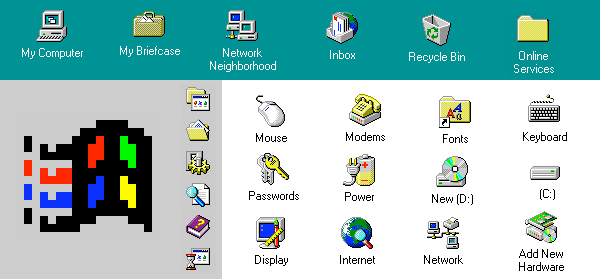
1995 – Windows 95
1997 Macintosh OS 8 — Brighter Icons for Mac
In Mac OS 8 the icons are now beginning to look brighter and rendered to show a strong light source. Macintosh also starts to implement an isometric style with a strong "drop shadow".
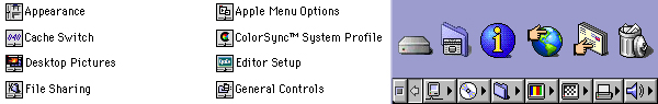
1997 – Macintosh OS 8
2001 Mac OS X v10.0 — Jelly Mac
Mac OS X was released around the time I was studying for my degree in Multimedia. Lovingly called the "Jelly Mac" by most of the students. We couldn’t help but notice the ultra shiny and plastic-jelly like finish of the icons. The icons in OS X are also a huge leap forward in design from the previous OS 9, which was released just two years earlier (OS 9 looks almost the same as OS 8 above.) Presumably, due to the Dock, the icons are rendered either from a straight forward point of view or slightly above. Designed around the new Aqua theme, icons show complex reflections, highlights and textures. Without the Aqua theme, I doubt that icon design would be as desirable as it is today.
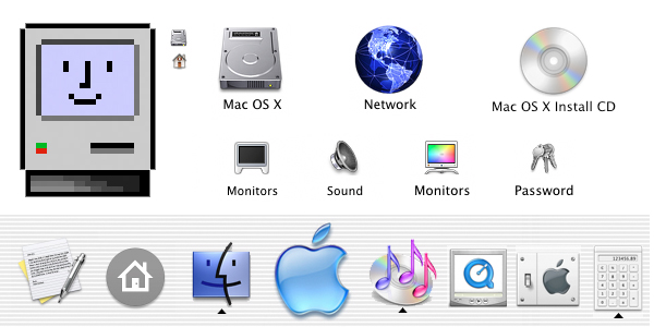
2001 – Mac OS X v10.0
2001 Windows XP — Bright Soft Icons
In 2001 Microsoft introduced, yet another, completely new OS system. Adopting a saturated color palette, the icons are rendered with a soft illustrative look that uses a single light source and a semi transparent drop shadow. They continue to use the isometric style.
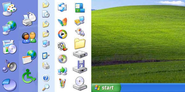
2001 – Windows XP
2007 Mac OS X Leopard — Reflective Dock
Mac ditches the stripes and adopts a 3D reflective doc for the icons to "sit on". The use of chrome, glass and reflections is as popular as ever. The icons don’t change much from v10.0.
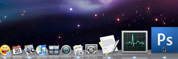
2007 – Mac OS X Leopard
2009 Windows 7 — Soft and Reflective
The Windows 7 icons are completely different from Windows XP and similar to Windows Vista. The major difference between Vista and 7 is the direction the icons are facing. I haven’t been able to find any official documentation on the change, but I’m not the only one who’s asking the question. The icons in Windows 7 are also softer and more glassy than previous ones.
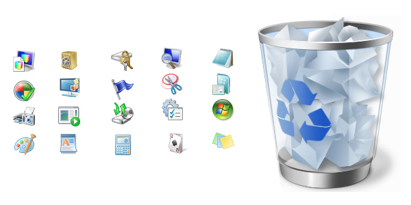
2009 – Windows 7
Resources & Further Reading
More to Come Soon
In the next installment (Know Your Icons Part 2 – Modern Icon Design) we will be delving further into the world of icons and exploring what icons mean to us today.
"


 On August 18th, an expedition team will be heading out to the Titanic site to create a 3D map of the wreckage 2.5 miles beneath the sea. 1,522 people died in the Titanic shipwreck in 1912; oceanographer Robert Ballard discovered the remains in 1985, and since then a bunch of different expeditions have headed out there in an attempt to salvage artifacts or take photos. But this one appears to be by far the most technologically intensive and expensive mission.


